Every year brings a fresh wave of “must-have” web design trends — and every year, a handful of last year’s trends quietly disappear. The trick isn’t chasing every new visual fad; it’s knowing which trends actually improve how people experience your site, and which ones just look good in a portfolio screenshot.
Here are five trends worth your attention in 2026 — and three that are past their expiration date.
5 Trends Worth Adopting
1. Accessibility as a Design Foundation, Not an Add-On
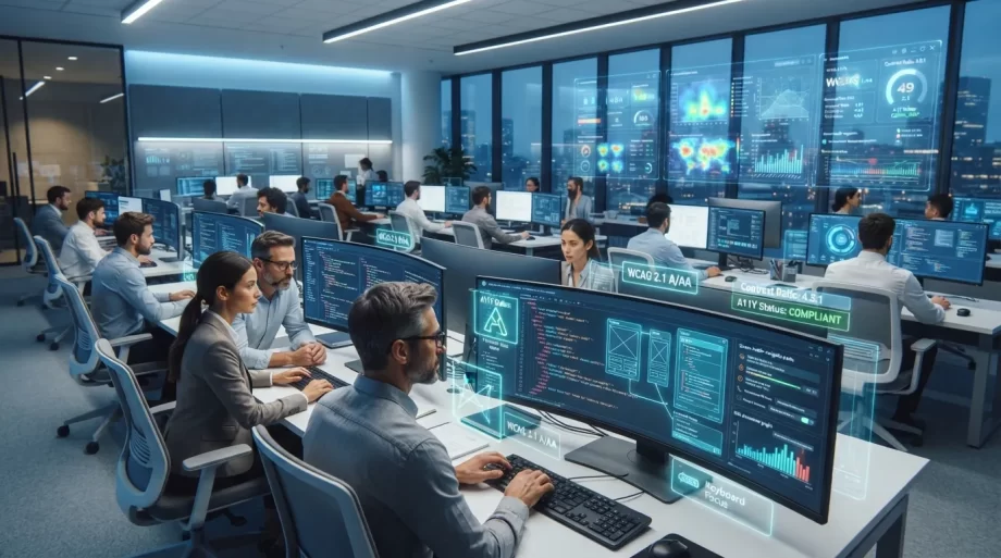
Accessible design used to be treated as a compliance checkbox tacked on at the end of a project. In 2026, the best-performing sites build it in from the first wireframe — strong color contrast, clear focus states, and logical navigation aren’t a separate task anymore; they’re just good design.
Why it matters: Beyond reducing legal risk, accessible sites are easier for everyone to use — including mobile users, older visitors, and anyone browsing in bright sunlight or a noisy environment.
2. Fast-Loading, “No-Bloat” Pages
Heavy animations and oversized hero videos have quietly given way to leaner, faster-loading pages. With Google’s continued emphasis on Core Web Vitals and users abandoning slow sites within seconds, speed has become a design decision, not just a technical one.
Why it matters: A beautiful site that takes six seconds to load is losing visitors before they ever see the design.
3. Clear, Single-Purpose Landing Pages
Rather than cramming every service and message onto one homepage, more sites are building focused landing pages — each with one clear goal, one clear audience, and one clear call to action.
Why it matters: Visitors decide whether to stay on a page within seconds. A focused message converts far better than a page trying to be everything at once.
4. Authentic, Unpolished Photography
Stock photos of overly staged office high-fives are fading out in favor of real photos — real team members, real workspaces, real product shots — even if they’re less “perfect.”
Why it matters: Visitors are increasingly good at spotting generic stock imagery, and it quietly erodes trust. Authentic photography signals a real business behind the website.
5. Micro-Interactions With a Purpose
Small, subtle animations — a button that gently confirms a click, a form field that shows real-time validation — are replacing flashy, decorative motion. The goal isn’t to impress; it’s to guide.
Why it matters: Purposeful micro-interactions reduce user confusion and make a site feel more responsive, without slowing it down or distracting from the content.
3 Trends That Are Already Dead
1. Auto-Playing Background Video Heroes
Full-screen video backgrounds were everywhere a few years ago. Today, they’re widely recognized as a performance and accessibility liability — slow to load, distracting, and often unreadable behind overlaid text.
2. Excessive Parallax Scrolling
Layered scroll effects once felt cutting-edge; now they’re more often associated with slow, disorienting sites that struggle on mobile. A little movement can add polish — too much just gets in the way.
3. Hamburger Menus on Desktop
Hiding navigation behind a hamburger icon made sense for mobile screens, but doing the same on desktop — where there’s plenty of room for a visible menu — is now seen as an unnecessary extra click that hurts usability rather than helping it.
The Real Takeaway
The trends worth adopting in 2026 share a common thread: they all make a site easier to use, not just more visually interesting. The ones fading out tend to prioritize looking impressive over actually working well for visitors.